Values in Painting: Why Your Color Looks Off
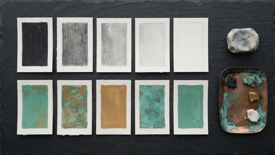
Values in painting are the lightness or darkness of each area, independent of hue. Block the whole image in three greys first, a light, a mid and a dark, check that it reads with the squint test, then add color on top with a Color or Overlay layer. When the values hold, almost any palette works.
Color gets the blame, but value does the work. A painting with a strong value structure reads even in greyscale; a painting with beautiful colors and weak values falls apart the moment you desaturate it. This tutorial covers values in painting the way a working painter uses them: a three-grey block-in, a squint test, a digital greyscale proof, then color on top. It belongs to the digital painting fundamentals pillar and is the step before layer blend modes for shading make sense.
What value actually is, and why the eye reads it first
Value is how light or dark a color is, independent of its hue. A saturated yellow and a pale grey can share the same value even though they look nothing alike. Tate's glossary entry on tone uses the older word for the same thing; value, tone and lightness all mean position on a scale from black to white.
Your eye reads value before it reads color. The visual system separates a scene into shapes by lightness contrast first and hue second, which is why value structure makes an image legible from across the room or as a thumbnail. Of the seven elements of art, value is the one that decides whether a picture reads at all.
Common color complaints and the value cause behind each
Most requests for color help are value problems in disguise. Before you touch a hue slider, find your complaint here and check the value cause first.
| Complaint | Value cause | Fix |
|---|---|---|
| The painting looks muddy | Too many mid values; lights and darks not separated | Push the light group lighter and the dark group darker |
| Saturated colors still look dull | Lights and shadows sit at the same value | Drop the shadow value; bright reads bright only next to darker |
| The focal point does not pop | The highest contrast sits somewhere else | Reserve the lightest light and darkest dark for the focal area |
| Figure merges with the background | Figure and ground share a value | Shift one by a full step, or lose the edge deliberately on one side |
| Skin looks grey or dead | Shadow painted in grey on Normal | Paint shadow as a darker, cooler version of the skin hue |
| Fine up close, wrong as a thumbnail | Value groups broken up by detail | Merge shapes; repaint detail that crosses a value boundary |
The three-value blocking exercise
This is the core of values in painting and it takes one sitting. Work entirely in greyscale with three flat greys, no blending and no gradients, and commit every shape to one of the three. The National Gallery's entry on grisaille describes the same idea as historical practice: a monochrome underpainting that settles drawing and lighting before color goes on.
Set up three swatches
Make three flat greys at 25, 50 and 80 percent lightness (in HSB, B = 25, 50 and 80 with S = 0). These are your dark, mid and light. Do not eyedrop anything else during the exercise.
Fill the canvas with the mid grey
Everything starts at 50 percent. Most of a painting sits in the mid range, and a mid ground stops the white canvas from tricking your eye about what counts as light.
Cut in the dark group
With a hard round brush at 100 percent opacity, paint every shape in the shadow family in the 25 percent grey: cast shadows, the shadow side of the form, dark hair, dark clothing. Group them; do not describe them.
Add the light group last
Paint the lit planes in the 80 percent grey. Keep the light group smaller than the mid group and keep it connected: a scatter of light patches reads as noise, a few large light shapes read as light.
Squint and fix
Squint until the image blurs. If two neighbouring shapes vanish into each other and you needed them separate, move one to another grey. When the picture reads as three clear masses, the block is done.
The steps are unequal on purpose. The gap between mid and light is wider than the gap between dark and mid because lit surfaces are where the eye goes. Never use pure black or white in the block: keep them for two or three accents at the focal point.
Protect your extremes
Once the block reads, you earn two more values: a near-black around 10 percent and a near-white around 95 percent. Use them in tiny amounts, only at the focal point. If everything is high contrast, nothing is. The National Gallery's note on chiaroscuro shows how far rationed extremes can carry a picture.
How to run the squint test
Squinting throws away detail and color and leaves you with value masses. If the image still reads when squinted, the value structure is sound. Do it at every stage, from block-in to final render. The digital version is a zoom-out to 10 or 15 percent, which does the same job without the eye strain.
- Count the masses. A sound structure squints down to three to five shapes. Ten means too many value steps.
- Check the silhouette. The subject should separate from the background somewhere and merge with it somewhere else.
- Find the brightest spot. If your eye lands on a background highlight instead of the focal point, move the contrast.
Checking values digitally: three ways to see greyscale
Squinting is the habit. These three checks are the proof. Set them up once in your template file so they are a single click away.
A desaturation adjustment layer
Add a Hue/Saturation adjustment layer at the top of the stack with saturation at minus 100, and toggle it as you paint. The Krita Manual's adjustment filters page documents the Desaturate filter and its lightness options; Choose the Luminosity or Lightness method rather than Average, because it weights green higher than blue the way the eye does.
A black layer set to Color
Fill a layer with black and set its blend mode to Color. It strips hue and saturation while keeping every value beneath it, and it exists in every app with blend modes. Keep it hidden in a group named CHECK at the top of the file and show it whenever you doubt a passage. The layer modes cheat sheet lists what Color is called in each app.
A greyscale proof export
Before calling a piece finished, export a flattened greyscale copy at about 300 px on the long side and view it beside the color version. If the thumbnail reads and the color version does not, the color is fighting the values, usually saturation contrast in the wrong place. Keep the proof with your working files; it is good evidence if you ever need to document your art process.
Adding color on top of a solid value structure
Once the greyscale reads, bring color in without disturbing it. Each route keeps the value study underneath as a safety net.
| Method | Layer setup | Best for |
|---|---|---|
| Color layer over grisaille | Mode Color, 100 percent; paint hue and saturation only | Fast recolor, trying palettes, matte surfaces |
| Overlay or Soft Light glaze | Overlay at 20 to 40 percent, or Soft Light at 40 to 60 | Warming lights and cooling shadows in one pass |
| Opaque repaint sampling values | Normal layer; match each hue's value to the grey beneath | Final rendering, skin, real color mixing |
The trap in the third method is drifting lighter as you add saturation, because a saturated color looks brighter than a grey of the same value. Toggle the black Color layer every few minutes; if the repaint has crept toward the mid, darken it back. A value boundary that was crisp in the block-in should stay crisp in color, which is where hard and soft edges take over.
Mistakes that break values in painting, and the fix for each
| Mistake | How it looks | Fix |
|---|---|---|
| Starting on white | Every mark reads as dark; the painting ends up too light | Fill with 50 percent grey before the first stroke |
| Five or more value steps in the block | Busy, soft, no clear light direction | Collapse to three; add extremes only at the focal point |
| Rendering before the block reads | Beautiful detail on a picture that fails as a thumbnail | Squint test every ten minutes; no detail until the masses hold |
| Fixing a value with a hue | Shadows go purple or green instead of darker | Correct on the black Color check layer first, then color |
| Highlights everywhere | Shiny, restless, no focal point | One highlight group, at the focal point |
Values first, then color
Block in three greys at 25, 50 and 80 percent, squint until three masses hold, prove it with a Color layer or a greyscale export, and only then add hue. That is the whole discipline of values in painting: it separates the two hardest problems so you solve them one at a time. With the structure locked, layer blend modes for shading shows how Multiply and Screen build on it.
Common questions
What is value in the 7 elements of art?
Value is the lightness or darkness of a color, from white through the greys to black. It sits alongside line, shape, form, space, color and texture as one of the seven elements. In painting it decides whether shapes separate or merge, which makes it the element most responsible for a picture reading at a distance.
Can you give me an example of value in art painting?
A portrait with the lit face at 80 percent lightness, the shadow side at 50 percent and the hair and background at 25 percent is a three-value painting. Squinted, it reads as three shapes. Grisaille underpaintings and charcoal studies are historical examples where value carries the whole image with no color at all.
What is another word for value in art?
Tone is the most common alternative, and lightness or luminosity appear in software. Older texts say light and shade. Chiaroscuro names the strong contrast of light and dark values as a style. All describe the same scale from black to white, independent of hue and saturation.
How do I check values in a digital painting?
Put a black-filled layer set to the Color blend mode at the top of your stack, or a Hue/Saturation adjustment layer at minus 100 saturation, and toggle it on. Zoom out to about 15 percent or export a 300 px greyscale thumbnail. If the image still reads as three to five clear masses, the values hold.
Sources and further reading
Primary references for the facts and definitions in this piece, all from independent publishers:
- The National Gallery: Grisaille: painting in greyscale values before or instead of color.
- Tate: Tone: tone as the lightness or darkness of a color, the value this method blocks first.
- The National Gallery: Chiaroscuro: strong value contrast as the basis of readable form.
- Krita Manual: Adjustment filters: the desaturate filter and lightness methods used for the digital value check.
This method is part of the digital painting fundamentals pillar. Pair it with Layer Blend Modes for Shading, Explained and Blend Modes Cheat Sheet for Digital Painting. Keep the printable blend mode reference open while you paint.