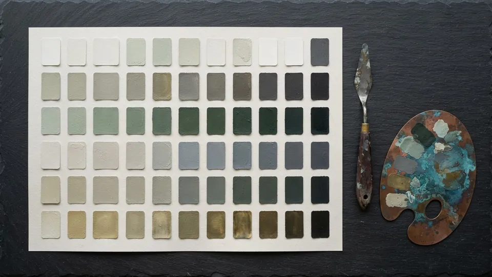
Muted Color Palette Collection
The Muted Color Palette Collection is twenty free desaturated color palettes for digital artists: six skin tone ranges, fabric and material sets, atmospheric ranges for depth, and neutral grey and earth ranges. Each palette is eight swatches ordered from light to dark, so it drops straight into a value first painting. Free for personal and commercial use.
A muted color palette is the fastest way to make a painting look considered: low saturation colors sit together without fighting and leave room for one accent at the focal point. This collection is the color half of the free brushes and resources library, twenty palettes built for value first painting. The download bundle is still being finalized; every palette is documented below.
What it is for
Muted color is easier to control than saturated color, and it flatters almost any subject. Each palette here is arranged from light to dark so you can see its value range at a glance, which makes it easy to build a painting value first and choose hues at the right value. Save your brightest, most saturated accent for the focal point and let these ranges carry the rest.
Tate's glossary defines a palette as both the mixing surface and the chosen range of colors for a work. This collection is the second sense, a restricted range decided before painting starts. A picture built from one eight swatch palette holds together in a way one built from a full color picker rarely does.
What is inside
| Palette family | Character | Use it for |
|---|---|---|
| Skin Warm Light, Mid, Deep | Peach to umber, saturation 15 to 35 percent | Warm undertone skin |
| Skin Cool Light, Mid, Deep | Rose to violet brown, saturation 12 to 30 percent | Cool undertone skin |
| Fabric Linen, Wool, Denim, Silk | Greyed hues, one cleaner mid | Clothing and drapery |
| Material Stone, Wood, Metal | Near neutral | Props, architecture, armor |
| Atmosphere Dawn, Dusk, Overcast, Night | Cool light end, warm or violet dark end | Backgrounds, depth |
| Neutral Grey Warm, Grey Cool | Saturation under 8 percent | Grounding, shadow mixing |
| Earth Ochre, Earth Umber | Yellow brown to red brown | Ground, hair, underpainting |
Six skin, four fabric, three material, four atmospheric, two neutral and two earth make twenty. Every palette is eight value ordered swatches covering at least seven of ten greyscale steps, so a form turns fully inside one palette.
Settings that matter
A muted palette is defined by its saturation ceiling and its value spread; those two numbers matter more than hue. Digital color does not mix like paint, as the Krita Manual's page on mixing colors explains, so these palettes are built to be picked from, in-between values included.
| Family | Saturation ceiling | Value spread (0 to 100) | Hue drift light to dark | Keep it muted by |
|---|---|---|---|---|
| Skin | 35 percent | 25 to 92 | Orange in light, red or violet in shadow | Never darkening with black |
| Fabric and material | 25 percent | 15 to 85 | Toward the complement in shadow | Cleaner mid swatch on lit folds only |
| Atmosphere | 30 percent | 20 to 95 | Warm to cool | Distance painted with the cool light end |
| Neutral and earth | 8 to 20 percent | 10 to 90 | Almost none | Mixing shadows from these |
One saturated accent per painting, chosen by hand, where the eye should land. Everything else comes from the palette.
A short workflow with this set
A character bust in an hour, in the order values before color.
Choose one palette and load it
Skin Warm Mid for the face, imported into the app's palette panel.
Block three values in greyscale
Light, mid, dark, hard round.
Replace each grey with the palette swatch at the same value
Desaturate a copy of the palette to match swatches to greys, then paint those three over the blocks.
Turn the form with the neighbors
The swatches either side of each block soften the terminator, as the edges tutorial describes.
Add a second palette for the setting
Atmosphere Overcast behind the figure, lighter cool end furthest away, so the shared low saturation unifies figure and ground.
Place the single accent
One saturated color, by hand, on the eyes or a light source.
Tips for getting the most from it
- Desaturate the palette to check its value spread before you paint with it.
- Pick one palette per piece and resist adding outside colors until the end.
- Use the cool swatches in shadows and the warm ones in light for instant unity.
- Add a single saturated accent by hand, placed where you want the eye to land.
- Pair a warm skin palette with a cool atmosphere palette, or the reverse; Tate's note on complementary colours explains why opposed pairs read as light and shadow.
Pairs well with
The palettes are value ordered so they drop straight into blocking with the painterly brush set, and they make calm flat fills behind line work from the ink and lineart brushes.
Common problems and fixes
| Problem | Likely cause | Fix |
|---|---|---|
| Painting looks dull and lifeless | No accent, or values too close | Widen the value range, then add one accent |
| Skin looks grey or dead | Shadows darkened with black | Pick shadows from the palette's deep end |
| Everything the same temperature | One palette for figure and setting | Warm skin, cool atmosphere, or the reverse |
| Wrong on a dark canvas | Started from the lightest swatch | Block from the mid |
Muted color palette, in short
Choose one eight swatch palette, block the values in grey, replace each grey with the swatch at the same value, unify figure and setting with a warm and cool pair, and place one saturated accent by hand. That is how a muted color palette carries a whole painting without the colors fighting. For the layer stack above, see layer blend modes for shading.
How to install it
New to installing resource sets? The getting started guide to the brush sets walks through importing a set and choosing the right one for the job. For where these fit in a painting, see the digital painting fundamentals pillar, and browse the rest of the free brushes and resources library.
Sources and further reading
Primary references for the facts and definitions in this piece, all from independent publishers:
- Tate: Palette: the palette as both a surface and a chosen range of colors.
- Tate: Complementary colours: warm and cool pairs used for unity in light and shadow.
- Krita Manual: Mixing colors: how digital color mixing differs from paint.
Free to use in personal and commercial projects. Do not resell the files themselves as your own pack. That is the only rule, and the full wording is in the terms of use for tutorials and resources.
Common questions
What is a muted color palette?
A set of colors with saturation typically under 35 percent in HSB terms, so no hue shouts. Muted colors are made by greying a hue toward its complement rather than adding black, and it still needs a full value range.
What skin tones work with muted colors?
All of them, because a muted skin palette is built from the undertone. Warm undertones use peach to umber; cool undertones use rose to violet brown. The six skin palettes cover both at three depths, shadows leaning red or violet.
What colors go well with muted tones?
Other muted tones from the complementary family, plus one saturated accent. Warm muted skin against a cool muted background reads as light and shadow; one clean red or teal on the focal point carries the picture.
Are these desaturated color palettes for digital painting only?
They are built for digital work, where colors are picked rather than mixed, but the value ordered swatches work as mixing targets in gouache too. The files are being finalized for release.
Related reading
- Values in Painting: Why Your Color Looks OffIf a painting looks wrong in color, it is almost always wrong in value. Build the value structure in three greys before you touch hue, and color becomes the smaller half of the job.
- Paper & Canvas Texture PackTen tileable grain overlays to give digital work a made by hand surface. Set to Overlay or Soft Light at low opacity, applied last.
- Ink & Lineart Brush SetTwelve crisp tapering brushes for character line work. Natural pressure taper, minimal texture, and one inker you can use for a whole piece.
- Blend Modes Cheat Sheet for Digital PaintingThe blend modes that do the real work in digital painting, what each does to the pixels beneath it, the job it is best suited for, and a starting opacity. Keep it open while you paint.