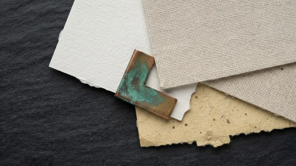
Paper & Canvas Texture Pack
The Paper and Canvas Texture Pack is ten free, tileable paper texture overlay files: fine and coarse paper grains, tight and loose canvas weaves, a watercolor cold press texture and subtle noise finishers. They sit above a finished painting on an Overlay or Soft Light layer at 10 to 25 percent opacity, free for personal and commercial use.
A paper texture overlay puts a surface back under clean digital paint. This pack is the finishing set in the free brushes and resources library: ten grains that add tooth without changing your values or colors. The download bundle is still being finalized; this page documents every texture, the blend settings, and the order to apply them.
What it is for
Digital work can feel sterile because every pixel is perfectly clean. A subtle paper or canvas grain gives the eye something to rest on and makes a piece feel like it lives on a surface. These overlays sit on top of a finished painting at low opacity, adding tooth without changing your values or colors in any noticeable way.
In traditional painting the surface is decided first: the National Gallery's glossary describes the ground as the prepared layer a painting sits on, its grain showing wherever the paint is thin. A texture overlay imitates that ground after the fact, so it goes on last, at one strength across the whole image.
What is inside
| Texture | Surface character | Use it for |
|---|---|---|
| Paper Fine | Smooth tooth, barely visible grain | Clean inks, flat color, anything printed |
| Paper Coarse | Open, fibrous grain | Sketchy pieces, charcoal and pencil looks |
| Canvas Tight | Even, fine weave | Smooth painterly work, portraits |
| Canvas Loose | Wide, irregular weave | Loose brushwork, landscapes, large canvases |
| Cold Press | Dimpled watercolor paper | Washes, soft edges, illustration |
| Noise Fine, Noise Medium | Even speckle, no structure | Breaking gradient banding, final polish |
| Grain Warm, Grain Cool | Tinted paper tooth | A slight temperature shift |
| Fiber | Long random fibers | Handmade paper feel for posters |
Every file is tileable, so it covers any canvas without a seam, and each is leveled to mid grey so Overlay and Soft Light leave your values alone.
Settings that matter
The W3C compositing specification defines Overlay as Multiply below mid grey and Screen above it, which is why a mid grey texture on Overlay adds grain without shifting the average value. Soft Light is gentler; the Krita Manual's blending modes reference lists both.
| Texture | Blend mode | Opacity | Scale | Note |
|---|---|---|---|---|
| Paper Fine | Overlay | 10 to 15 percent | 100 percent at 300 dpi | The default for most work |
| Paper Coarse or Fiber | Soft Light | 15 to 25 percent | 100 to 150 percent | Larger reads as heavier paper |
| Canvas Tight or Loose | Overlay | 12 to 20 percent | 100 percent | Scale with canvas size |
| Cold Press | Multiply | 8 to 12 percent | 100 percent | Multiply keeps the dimples in the light areas |
| Noise Fine | Overlay | 5 to 8 percent | 100 percent | Kills banding, never visible on its own |
Keep the texture at native size or larger: scaled down it becomes noise, and up to 150 percent it still reads as paper. Apply one texture, never two stacked, or the grains interfere and produce a moire.
A short workflow with this set
Finish the painting first
A grain applied early gets painted over unevenly and shows as patches.
Flatten a copy and place the texture on top
Drop the texture file above the merged painting and tile it to fill the canvas.
Set the blend mode and opacity
Overlay at 15 percent for paper, Soft Light at 20 percent for canvas. The difference should be felt more than seen.
Mask it off the focal point
Layer mask, painted out at 30 to 50 percent over faces and fine detail.
Export and compare at print size
Grain that looks right zoomed out can be too strong at full size.
If a viewer notices the texture before the subject, halve the opacity. Correct grain is seen only when looked for.
Tips for getting the most from it
- Set the texture layer to Overlay or Soft Light at 10 to 25 percent opacity.
- Match the grain to the subject: fine paper for line work, canvas for painterly pieces.
- Mask the texture off faces and focal points if it competes with detail.
- Apply texture as the very last step so it stays consistent across the whole image.
- Use the same texture and opacity across a series so the pieces read as one body of work.
Pairs well with
Textures sit best over work made with the painterly brush set, and a fine paper grain also flatters clean line work drawn with the ink and lineart brushes. For the modes beneath the texture, see layer blend modes for shading.
Common problems and fixes
| Problem | Likely cause | Fix |
|---|---|---|
| Whole image went darker or lighter | Normal mode left on, or texture off mid grey | Set Overlay or Soft Light; level the texture to 50 percent grey |
| Visible tile seams | Tile cropped or scaled before tiling | Tile at native size, then scale the whole layer |
| Moire pattern | Two textures stacked, or canvas over a screen pattern | One texture only |
| Faces look dirty | Grain at full strength over skin | Mask it to 30 to 50 percent on faces |
Paper texture overlay, in short
Finish the painting, tile one texture above it on Overlay or Soft Light at 10 to 25 percent, mask it back over the focal point, and check it at print size. A paper texture overlay should be the last decision and the quietest one. For the sets that come first, the getting started guide to the free brushes covers installation.
How to install it
New to installing resource sets? The getting started guide to the brush sets walks through importing a set and choosing the right one for the job. For where these fit in a painting, see the digital painting fundamentals pillar, and browse the rest of the free brushes and resources library.
Sources and further reading
Primary references for the facts and definitions in this piece, all from independent publishers:
- The National Gallery: Ground: the prepared surface a painting sits on, which a texture overlay imitates.
- W3C: Compositing and Blending Level 1: how Overlay and Soft Light combine a texture with the painting beneath.
- Krita Manual: Blending modes: the overlay and soft light modes as they appear in a painting app.
Free to use in personal and commercial projects. Do not resell the files themselves as your own pack. That is the only rule, and the full wording is in the terms of use for tutorials and resources.
Common questions
How do I add a paper texture overlay to a digital painting?
Place the file on a layer above the finished painting, set the layer to Overlay or Soft Light, and lower the opacity to 10 to 25 percent. Tile it at native size, mask it back over faces, and apply it last.
What is the benefit of a paper or canvas overlay?
It gives a digital painting a surface. Clean pixels can feel sterile; a subtle grain gives the eye something to rest on, kills gradient banding, and makes a piece feel made on paper or canvas, without changing values or colors.
Does this texture overlay work in Procreate?
Yes. Import the file as an image on a new layer, then set the blend mode and opacity from the layer menu. The same files work in Krita, Clip Studio and Photoshop, since they are ordinary tileable images. The bundle is being finalized for release.
Canvas texture or paper texture: which should I use?
Match it to the work. Paper grain suits line work, flat color and illustration; canvas weave suits painterly pieces with visible brushwork; cold press suits washes and soft edges.
Related reading
- Painterly Brush SetSixteen textured round brushes for blocking, blending, and rendering in digital painting. Most finished pieces need only three of them.
- Muted Color Palette CollectionTwenty considered palettes in low saturation ranges for skin, fabric, and atmosphere. Eight swatches each, ordered from light to dark.
- How to Tell If Art Is AI: A Craft-Based MethodA craft-based way to judge whether an image was generated: provenance and process first, then construction, edges, light and detail, with an honest account of how reliable each tell is.
- Free Brushes: Getting Started With the SetsWhich of the free Bio Rust sets suits which job, how to import them into Procreate, Clip Studio and Krita, how to tune pressure, and how to keep a small brush library you actually use.