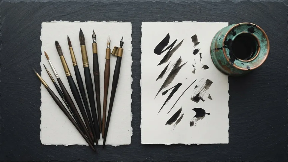
Ink & Lineart Brush Set
The Ink and Lineart Brush Set is twelve free ink brushes for digital line work: three tapered inkers, a weighted contour brush, two fine liners, a rough ink and five accent brushes. It is built for stylized character lineart in Procreate, Clip Studio, Krita and Photoshop, and it is free for personal and commercial use.
Good lineart depends on an inker whose taper matches your hand, and the discipline to use one brush for a whole piece. These free ink brushes were built around that idea and sit alongside the other sets in the free brushes and resources library. The download bundle is still being finalized; the notes below describe what it contains.
What it is for
Built for the clean, confident line work that stylized character art depends on. The tapered inkers start and end thin and swell with pressure, exactly the stroke you want for the heavy outer corner of an upper lash line or the tip of a hair mass. The weighted brush holds a steadier width for outer contours, where a slightly thicker line separates figure from background.
Everything in the set is smooth, opaque and pressure driven, so the variety comes from your hand and from line weight. The Krita Manual's inking tutorial makes the same point: line weight and stabilisation are what make inks read.
What is inside
| Brush | Stroke character | Use it for |
|---|---|---|
| Inker Fine | Thin taper, swells to about 3x | Interior lines, features, small figures |
| Inker Medium | Taper with a 5x swell | The main inker for most character work |
| Inker Bold | Heavy, fast swell | Large canvases, the upper lash line |
| Contour Weighted | Near constant width | Outer silhouettes |
| Liner Hair | Very fine, no swell | Hatching, lashes, fine strands |
| Liner Detail | Fine, short taper | Jewelry, eye detail, small forms |
| Rough Ink | Dry, broken edge | Expressive edges, rock, bark |
| Accent Flick | Snaps to nothing | Lash flicks, hair tips |
| Accent Fold | Tapers both ends | Cloth folds and creases |
| Accent Fill | Wide and flat | Solid blacks and shadow shapes |
Three tapered inkers, one weighted brush, two fine liners, one rough ink and five accent brushes (Accent Tip for strand ends and Accent Dot for stippling complete the five). Pick one inker as your daily brush; reach for the rest only where the drawing asks.
Settings that matter
Most complaints about lineart brushes are really about the pressure curve. The Krita Manual's tablet sensors page explains the curve these inkers rely on; Procreate and Clip Studio have the same control under other names. Tune it before you judge a brush.
| Brush | Size | Pressure curve | Spacing | Stabilizer |
|---|---|---|---|---|
| Inker Medium | 6 to 9 px | Default; flatten the start if lines jump to full width | 2 to 4 percent | 30 to 40 percent |
| Inker Bold | 10 to 14 px | Slightly concave so the swell arrives late | 2 to 4 percent | 30 to 40 percent |
| Contour Weighted | 8 to 12 px | Nearly flat | 3 to 5 percent | 50 percent or more |
| Liner Hair | 2 to 3 px | Flat | 1 to 2 percent | Low |
Keep opacity and flow at 100 percent, because a translucent ink line reads as pencil, and never scale a finished ink layer up; the taper softens.
A short workflow with this set
Inking a character bust in about forty minutes, from a construction sketch built as the anime head proportions tutorial describes.
Lower the sketch, add an ink layer
Sketch to 20 to 30 percent opacity, new layer named Inks above it. Keep the sketch as part of your process record.
Silhouette first
Trace the outer edge of the figure with Contour Weighted at 8 to 12 px, stabilizer high, one stroke per edge from the shoulder.
Interior lines with one inker
Inker Medium for everything inside. Press harder where a form turns from the light or overlaps another.
Weight the eyes
Inker Bold for the upper lash line, one stroke from the inner corner out with pressure rising, as in the anime eye method.
Accents, then flip and fill
Flicks, folds and tips with the accent brushes. Flip the canvas, fix what you now see, fill solid shadows with Accent Fill beneath the inks.
Silhouette heaviest, overlaps medium, interior lightest. Uniform weight reads as a coloring page.
Tips for getting the most from it
- Ink outer contours slightly heavier than interior lines so the silhouette reads first.
- Use one inker for a whole piece. Switching brushes midway changes the line character.
- Flip the canvas before inking. Wobbles you have stopped seeing become obvious.
- Keep inks on their own layer above the sketch, and archive the sketch layer too.
- Group the two or three brushes you use into a favorites set and hide the rest, as the getting started guide to the free brushes recommends.
Pairs well with
For a printed feel under clean inks, lay the paper and canvas textures over the finished piece, and choose flat fills from the value ordered muted palettes. In Procreate the set imports as its own group through the Procreate Handbook's Brush Library.
Common problems and fixes
| Problem | Likely cause | Fix |
|---|---|---|
| Lines jump to full width at a light touch | Pressure curve too steep at the start | Flatten the first third of the curve |
| Have to press hard for any width | Curve too flat, or a firm nib | Lift the middle of the curve |
| Wobbly long lines | No stabilizer, drawing from the wrist | Stabilizer 40 to 60 percent, move from the shoulder |
| Clean lines, flat drawing | Uniform line weight | Re-ink the silhouette heavier, interior lighter |
Ink brushes, in short
Pick one inker, tune its pressure curve, ink the silhouette heavier than the interior, and reserve the liners and accents for the few places that need them. That is the whole method behind these ink brushes. Under the inks, see the hair as blocks tutorial in the character pillar, where the tapered inkers do their best work on the tips of each mass.
How to install it
New to installing resource sets? The getting started guide to the brush sets walks through importing a set and choosing the right one for the job. For where these fit in a painting, see the digital painting fundamentals pillar, and browse the rest of the free brushes and resources library.
Sources and further reading
Primary references for the facts and definitions in this piece, all from independent publishers:
- Krita Manual: Inking: line weight, stabilisers and inking workflow.
- Krita Manual: Tablet sensors: tuning the pressure taper these inkers rely on.
- Procreate Handbook: Brush Library: importing a brush set as its own group on a tablet.
Free to use in personal and commercial projects. Do not resell the files themselves as your own pack. That is the only rule, and the full wording is in the terms of use for tutorials and resources.
Common questions
What brushes are best for ink lineart?
A smooth, opaque, pressure tapered round with no texture: it starts thin, swells under pressure and ends thin, with a stabilizer for long contours. The three tapered inkers in this set are exactly that.
Where can I find free ink brushes for Procreate?
This set is one place. It is free for personal and commercial work with no account or email, and imports as its own group in Procreate; in Krita and Clip Studio it arrives as a bundle or sub tool group. The bundle is being finalized for public release.
Do these ink brushes work in Clip Studio and Krita?
Yes. The set ships in formats for Procreate, Clip Studio, Krita and Photoshop. Each app applies its own stabilizer and pressure curve, so adjust the curve once after import and the sizes above hold.
Related reading
- Free Brushes: Getting Started With the SetsWhich of the free Bio Rust sets suits which job, how to import them into Procreate, Clip Studio and Krita, how to tune pressure, and how to keep a small brush library you actually use.
- How to Draw Anime Eyes: A Complete MethodThe eye is the anchor of a stylized face. Build it in the same order every time, from the gap to the lash line to the iris, and it stops feeling like luck.
- Painterly Brush SetSixteen textured round brushes for blocking, blending, and rendering in digital painting. Most finished pieces need only three of them.
- How to Draw Anime Hair as Blocks, Not StrandsStop drawing individual hairs. Group hair into a few large flowing masses from the crown, ink the edges with weight, and add one band of shine, and the whole thing reads as hair.